1. Cleardocs Over 10years
We'd been working with Cleardocs for well over 10years when we started the website rebuild process. From it's fledgling startup days to the the Thomson Reuters take-over, Cleardocs had retained it's leadership in the space. But with lots of slick smaller competitors were biting at their heels Thomson Reuters needed to double down on their dominance with a complete website rebuild.
2. User Experience
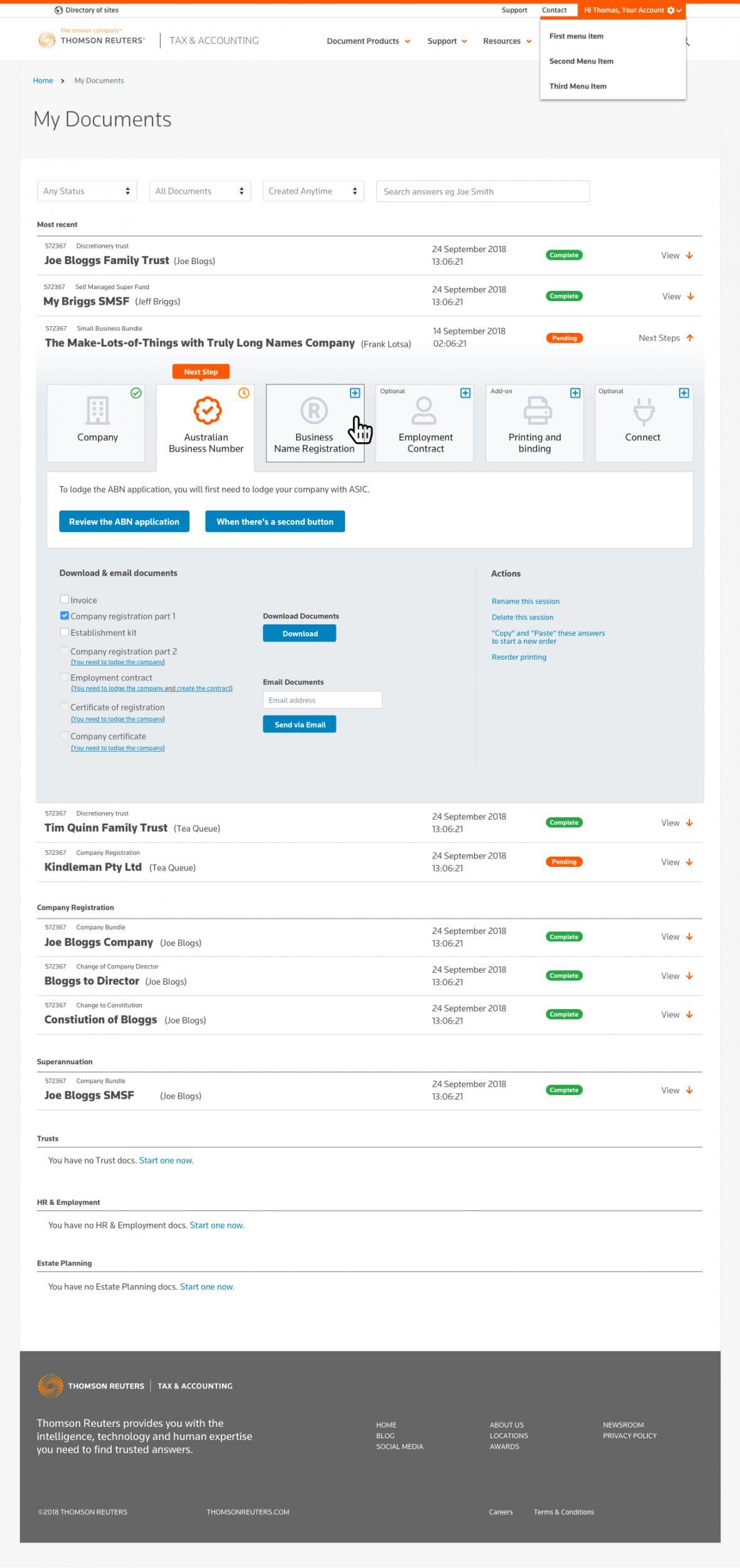
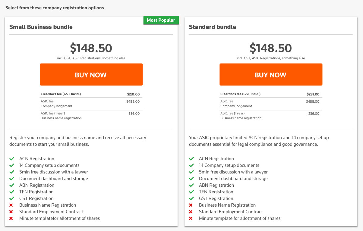
Legal documents don't come with attractive product images, but they DO come with a lot of highly specific and conditional information, ad-ons, options and pricing.
The target market being accountants, lawyers AND general punters gave us 2 different objectives.
- Make clear and fast paths to purchase for high-volume customers who understand the products, and just want to get on with their day, AND
- Make a browsing experience that didn't overwhelm with information, and kept the user moving forward to the purchase.
Honestly, we NAILED that.
3. BEING Authoritative
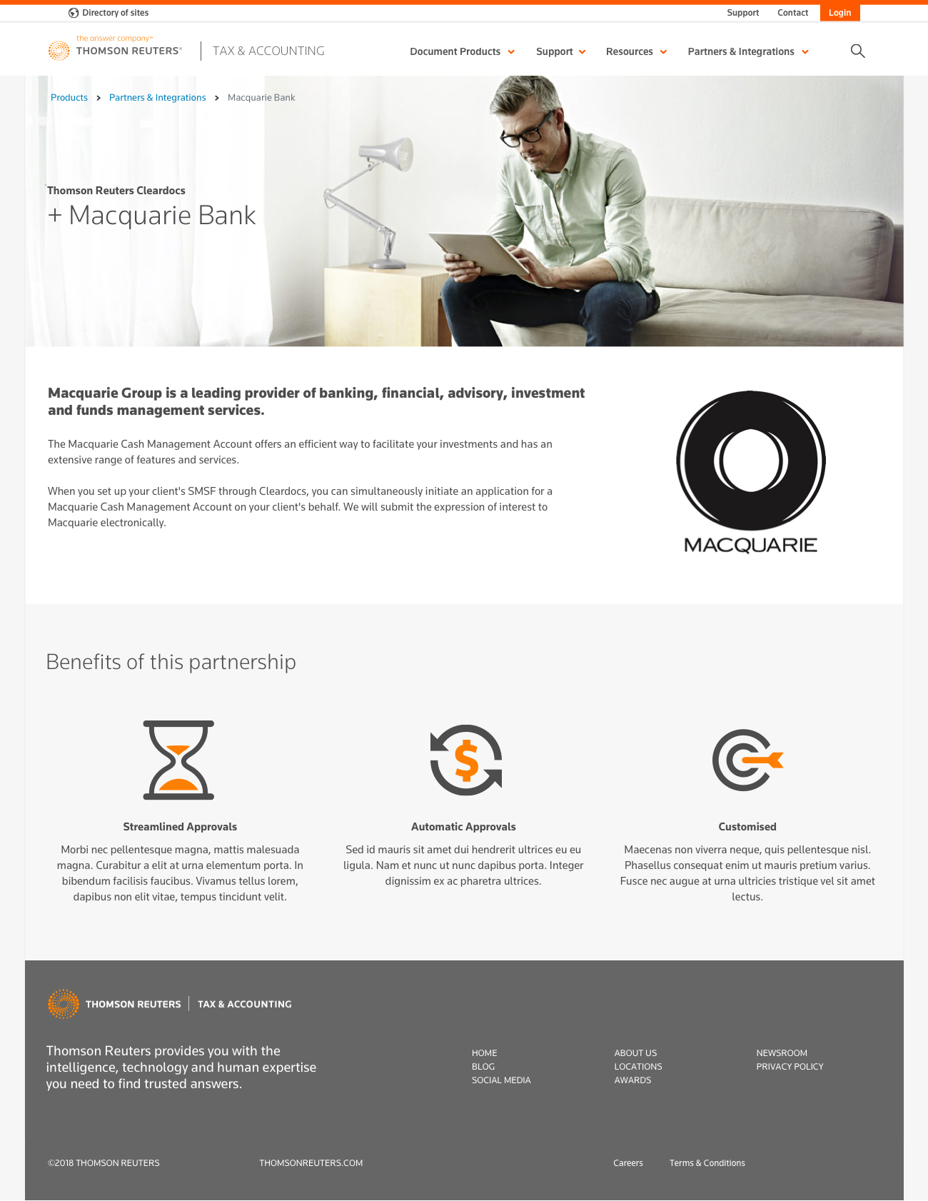
The clear distinction of buying from Thomson Reuters is their authority in research and quality. Their legal products are backed and their partnerships provide trust and comfort for the bigger end of town.
Throughout the interface, we provide cues that TR are that step above - the provider that you can trust, and the products you won't have to second-guess.
4. Front-end Implementation
To be honest, this is some of the more complicated front-end work we've ever done.
Because the required informational content is so text-heavy, building in huge amounts of variety for types of info required using the full gamut of tools.
Using Twitter's Bootstrap frontend framework with some very nifty extras, Kindleman devs adapted what was a lengthy process of refinement into highly usable and straightforward interfaces.
We consulted with Thomson Reuters development team throughout, giving them documentation and clear paths to success for their integration with their considerably large Java backend systems. It is due for completion in 2020.
5. Forms & Process design
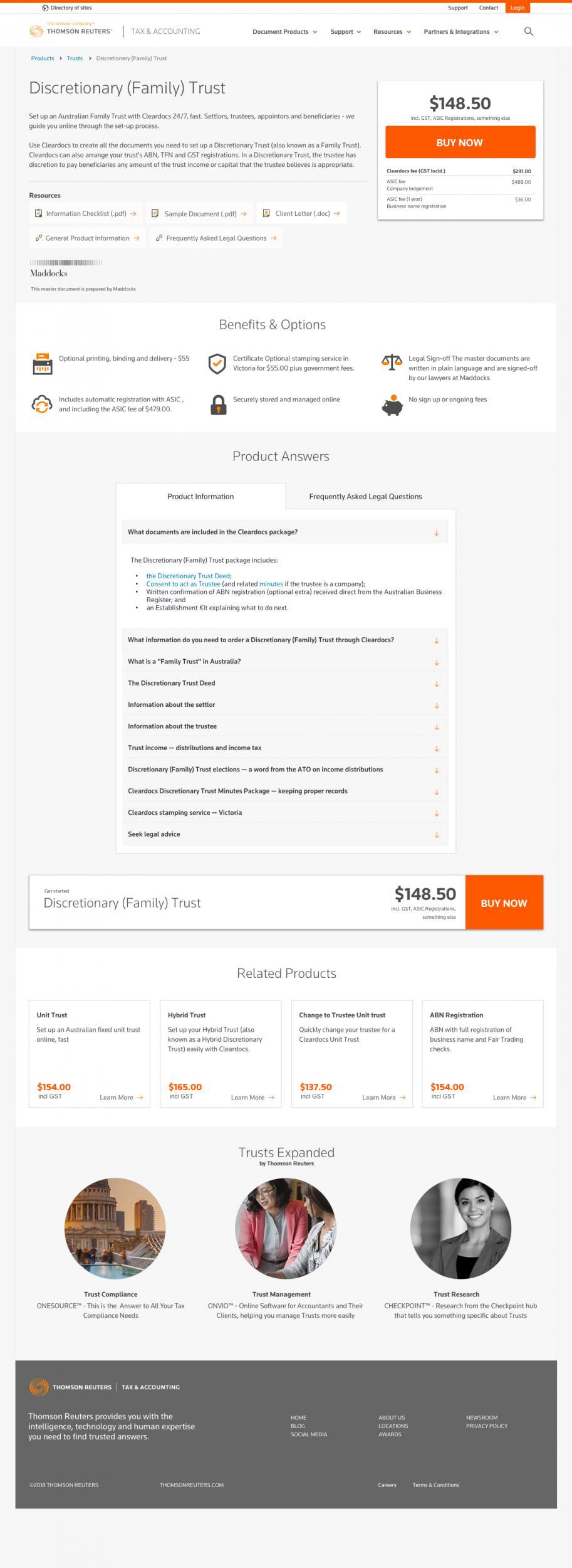
Forms, bus stops and in-page nav.
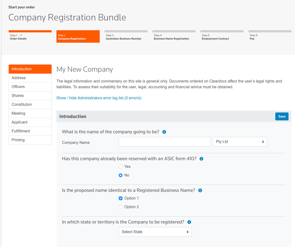
6. Process design
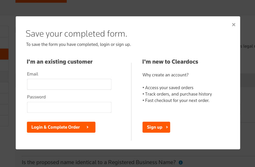
7. UX Planning
With 8 iterations and nearly 6months of the planning, we meticulously worked out all the user journeys, focus and information hierarchies, and documented them before we spent any time of the pretty stuff.
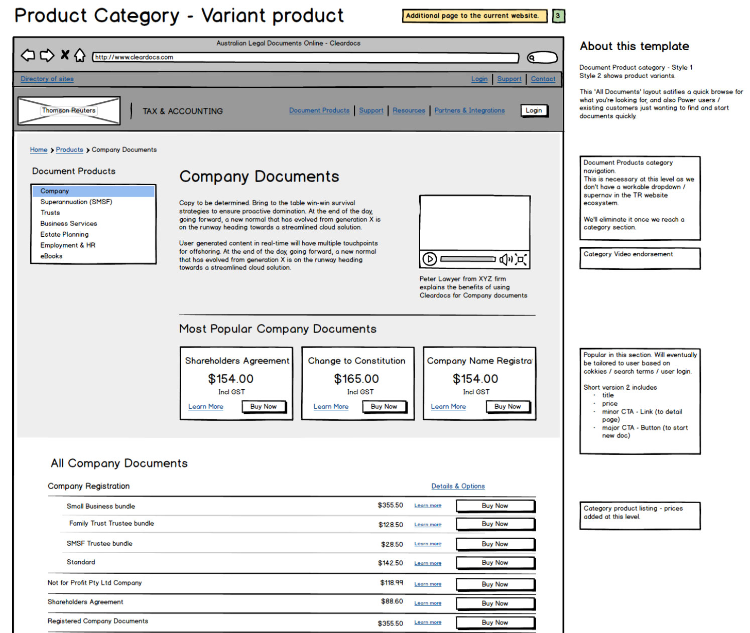
USER EXPERIENCE FOR USER CONVERSION
User experience makes a massive difference to the sale in a brand like Thomson Reuters. With quite high numbers coming through, a lot of product options, and an arduous process of entering company or personal information - we're working hard to reduce user drop-off.
This was ground-zero for conversion.


