1. A website for coffee enthusiasts
Danes is a specialty coffee company, passionate about educating their market in the intricacies of coffee.
2. Designing the coffee experience around information
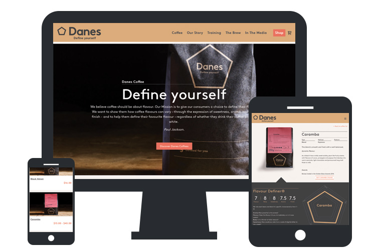
The frontend view of the coffee detail page shows extensive information structure that went into each coffee product.
We worked with branding agency Iconika to develop a visual story based on the classic Swiss Typography and Design styles that are a ubiquitous mark of quality and innovation.
Design patterns were invented and refined to fit with CSS conventions, grids and javascript as defined through our favourite frontend framework - Zurb Foundation.

3. Offering up variety
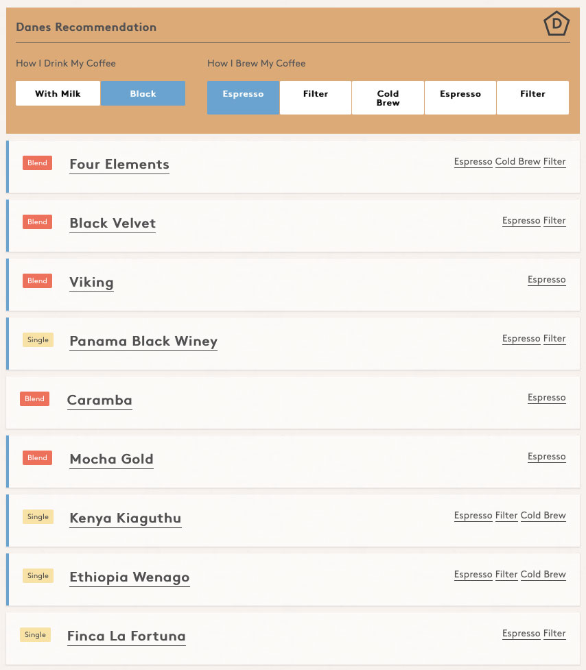
Just like wine producers, Danes coffees are produced to offer a breadth of taste experience. Danes mission is to convince people to try different coffees and different brewing methods. We built the coffee recommender to help choose, based on how you prefer your coffee.
4. Educating coffee enthusiasts
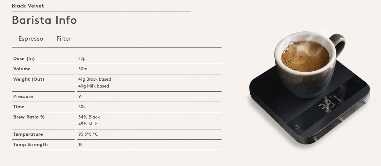
What goes in, is what comes out! When a barista uses Danes coffee, they're also taught to use the coffee machine. Baristas and home enthusiasts can refer to the website for specific specifications of any coffee.
5. Content relationships
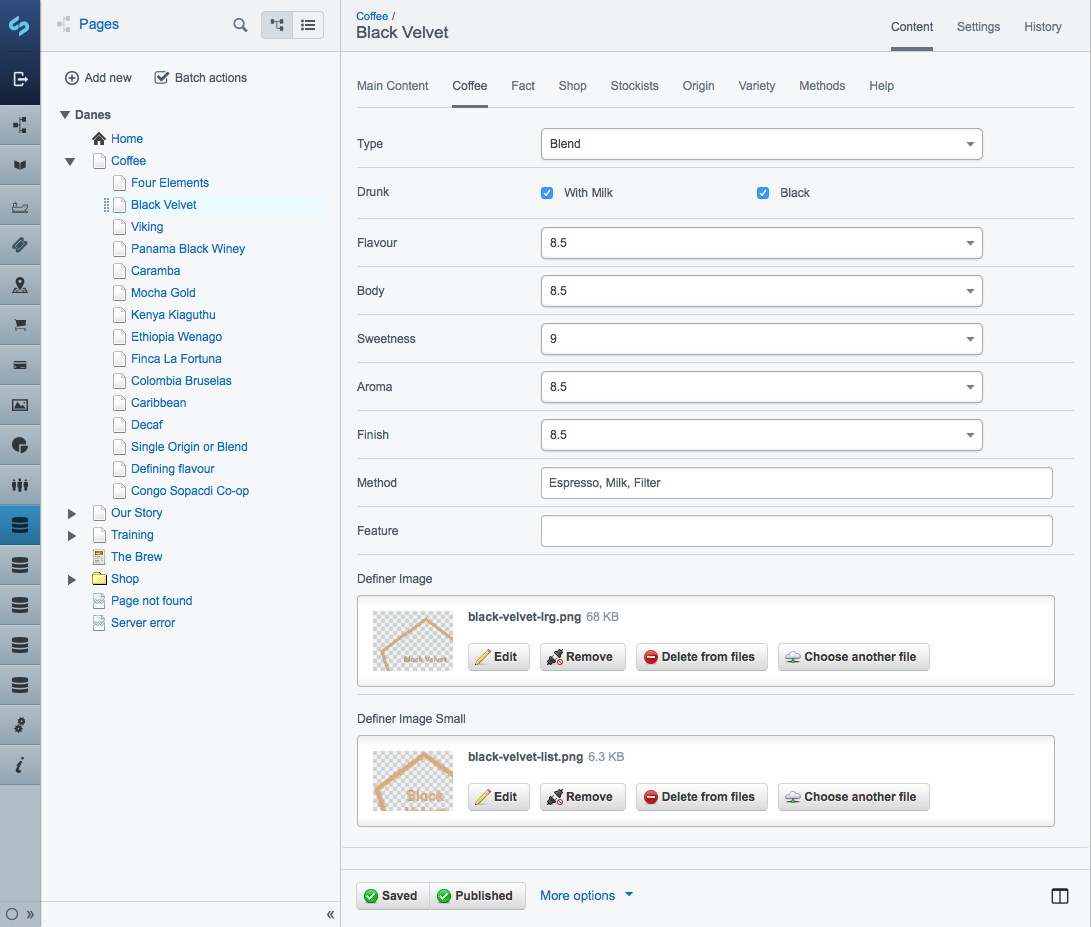
Silverstripe is very flexible with complex data relationships. One of the arts of development is structuring those content relationships within a CMS - so that website administrators can collect and deploy website content in a logical way.
6. Buy online, and other tech things to consider
With well structured content, intelligent use of copy, and Silverstripe's SEO-focused tools, we've built a website that will be found.
The eCommerce shop is integrated right into the CMS with the Silvershop extension. This is a great benefit for those who want to content power of Silverstripe, and need to sell products online. While it's not Shopify, the standard features are all available. And as with all Silverstripe extensions, you can extend as you need without risk of breaking the rest of the website (I'm looking at you Wordpress).
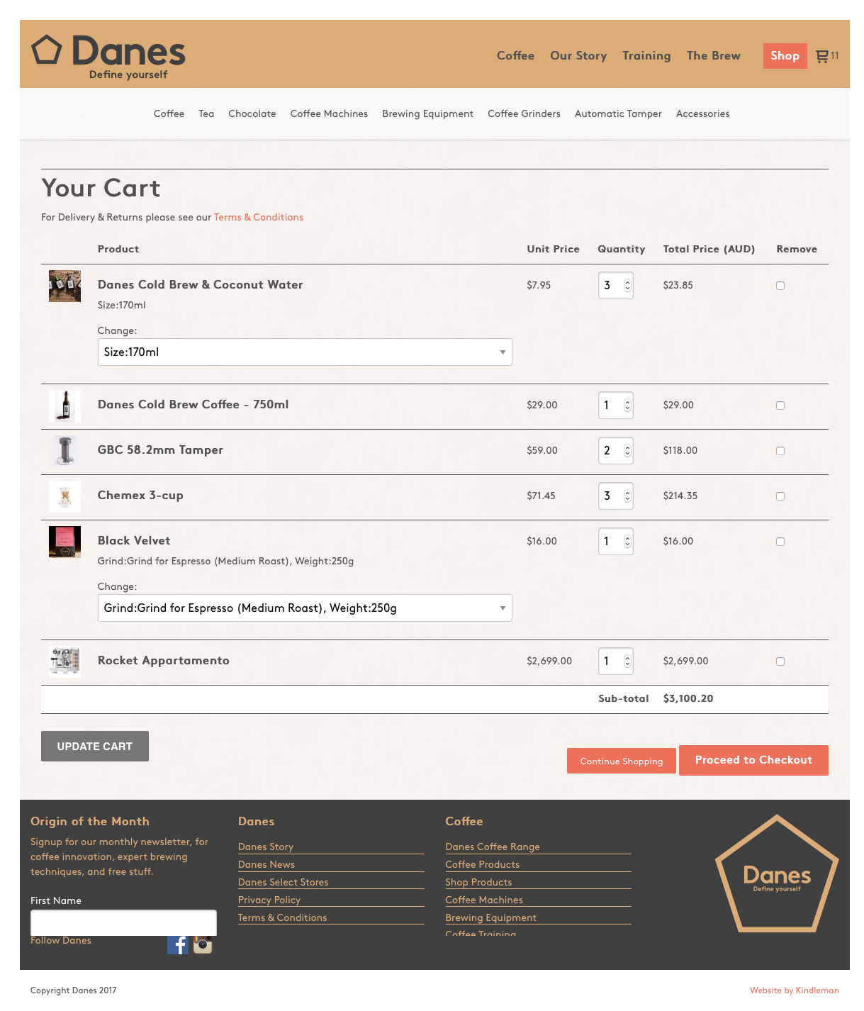
7. Shopping with variants
Much like 1 t-shirt comes in multiple colours and sizes, coffees come in different grinds and pack-sizes. A variants feature makes it easier to keep those products organised.
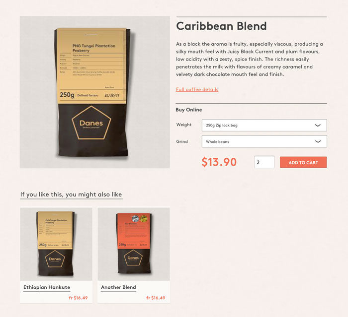
8. Content strategy - everything we do at Danes
Danes makes specialty coffees at their core, but part of their philosophy (and marketing) is building a relationship with enthusiasts.
Training, storytelling, blogging, coffee knowledge and driving people to coffee shops are reflected on the website.

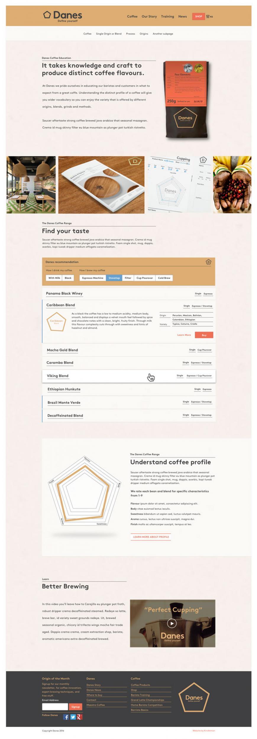
9. Coffee listing page
The coffee listing page gives some understanding of process and grading.
We used an accordion to list the coffees. This let us optimise the amount of information available within a limited screen height, so that the coffee recommender could easily be browsed.
The primary call-to-action takes the user to the shop item, while the secondary cta leads to highly detailed information. This choice was made to ensure the sale was central to the experience, but still encouraging the education of the user.
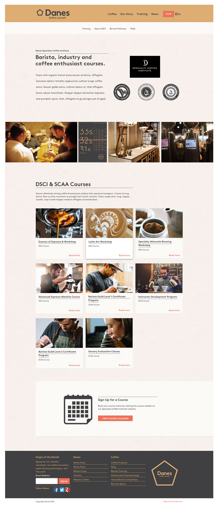
10. Training listing
Training is important to Danes, in that it converts people who want to be baristas, into baristas who are enthusiastic about Danes coffee.
We built a listing of the possible training with a plan to expand on the section to offer baristas a roadmap to greatness.
OUR PROJECTS ARE BUILT WITH HTML5, CSS3, AND STANDARDS.
That means we’re building websites that will stand the test of time, are scalable, and work across all the modern desktop and mobile browsers. It’s a big deal.


