1. Website that converts
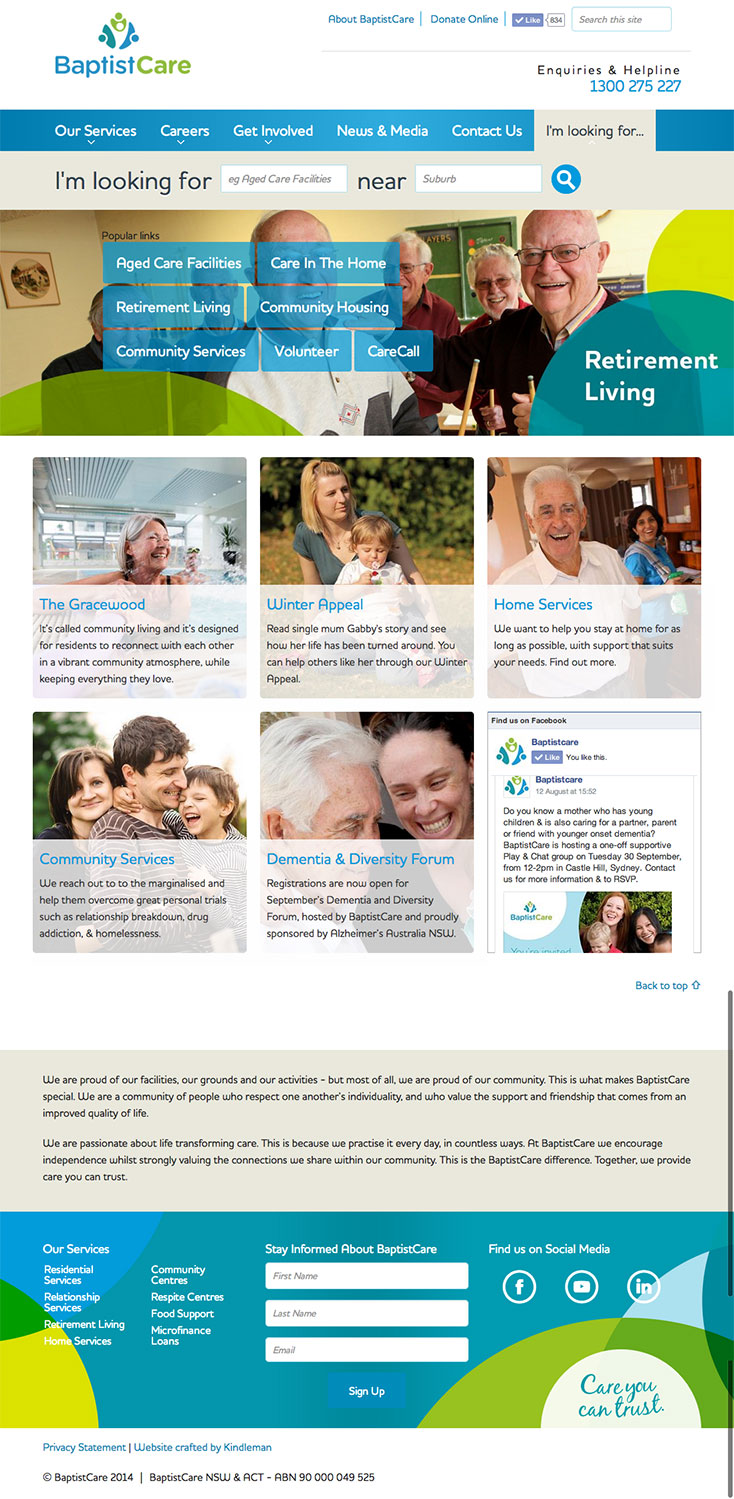
During a huge and highly successful brand and organisation overhaul lead by our partner ‘Be You Not Them’, Kindleman were engaged to build a CMS website.
Understanding the business sectors was key to cracking this project. With a multitude of different service offerings, all with their own requirements, serving users to the correct information quickly and pushing a conversion put us in seventh heaven – perfect job for Kindleman.
The Baptistcare website is extensive in it’s ability to mirror the organisation, taking donation payments, delivering complex shared data structures, integrating mapping and other APIs, and managing complex backend administration aspects.
We continue to work with BC on their search engine optimisation, analytics, accessibility, conversion optimisation, feature design and development.
Services
content strategy
front end
information architecture
responsive
silverstripe
ux
web design

2. Big content structure
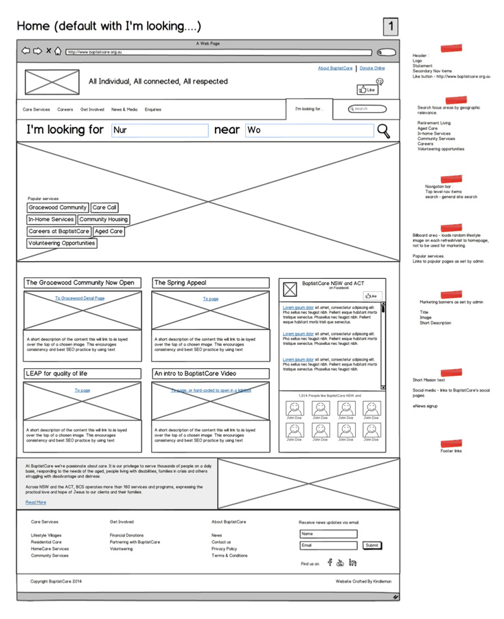
This projects had 2-3 months planning prior to any colour or code. That included stakeholder meetings, technical validation and acceptance, brand-alignment workshops, business-to-web workshops, competitive research, and eventually scope, spec, web architecture and UX design wireframing.
BaptistCare had a ton of existing content, with internal categorisations, complex relationships, exceptions and new requirements.
The challenge:
- establish a meaningful structure
- present it in an intelligible way to the public
- maintain BaptistCare’s unique content
This is the kind of site we love to take on; where true design starts with discussions, contemplation & business understanding.

3. Features for users
A content-heavy website needs a clearly navigable structure and methods to access content when you’re not entirely sure what you’re looking for.
The Aged Care industry has a wide range of service-types and terminology (eg ‘Aged Care’ is often called ‘Nursing Home’). A tagging system allows the complex services-types to cover different terminology, and combined with a Google GeoSearch we deliver the user quickly to relevant service content, greatly improving the chance of the user taking action.
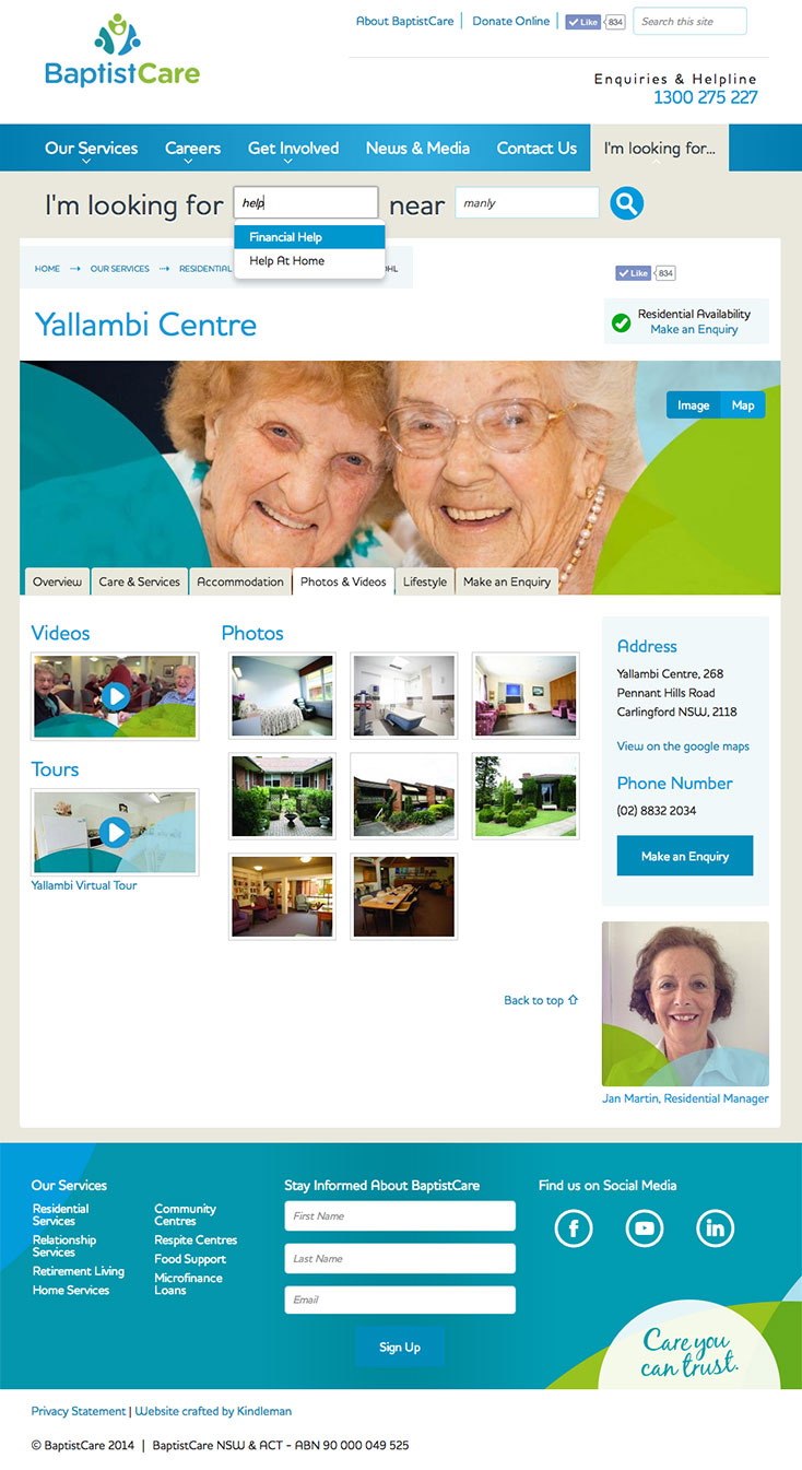
The service ‘facilities’ are where BC do much of their work. Each facility has it’s own characteristics, and different aspects appeal to various users. With maps and images, availability, relational service and career data, image photo galleries, informational aspects and contact opportunities all tabbed into one page, an extensive user experience feels compact and easily consumable.

4. Content Management with Silverstripe
Silverstripe is our CMS of choice for matching complex business structures to robust website builds.
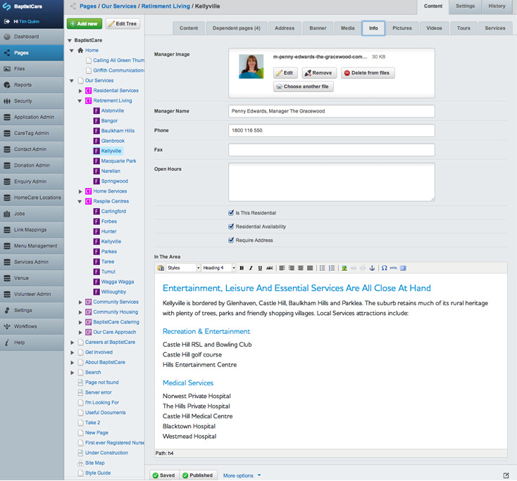
It’s flexible and well structured, with baked-in versioning, detailed permissions, and customisable workflow.
This enables our client to setup business units who control the content and interactions through the website – including setting up new service facilities, managing donations, career opportunities, correspondence, in-site marketing and analytics and menu management.

OUR NEW WEBSITE SETS THE STANDARD IN OUR INDUSTRY.
 Brendan Wood
- BaptistCare
ARE YOU AVOIDING A WEBSITE REBUILD?
The big website rebuild isn't a walk in the park when you've got 1000's of man hours invested in a web system. However, starting again will clarify divisions of your organisation, and eliminate dead-end methods This project fell right into that realm, and the results have been considerable both in brand equity and financial terms.


